Do you ever go downtown to a gallery on a Friday night, an unglamorous one you’ve been to several times, only to find that on this night it happens to be hosting the hottest opening in town and you’re the only one there in snow boots lugging a backpack? Me too.
But never mind. Looking at the remarkable images by Chicago street photographer Vivian Maier, and then at the tiny scrap of text on each label, I wanted to know more. Who are these people? What neighborhood is this? The stranger next to me (in four-inch Jimmy Choos) said, “The point is to bring your own story.” A romantic. But all right, fine—I can bring a story to street photos.
At the next gallery, next to each Elliott Erwitt photograph, there was a pushpin with a microscopic number on its head. The gallery catalog gave basic identification: 1960, during filming of The Misfits in Reno, Nevada.
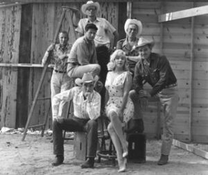
A group of us stood there guessing: Marilyn Monroe, Clark Gable, Montgomery Clift. Someone pointed out Arthur Miller. Who were the others?* What would Ms. Choo say—that the point was to bond with strangers while guessing the facts?
In publishing, there is always a war between text and display, and as a copyeditor, I’m going to fight for the text. Truly, I’m sympathetic to both. Recently I reviewed the layouts of a beautifully illustrated book about Chicago architect Henry Ives Cobb and noticed that on pages with multiple images the captions were often grouped on the facing page, and the images had no numbers. I spent some time making sure that there would be no confusion, and decided not to fuss. Besides, I knew the designer would rather swallow a page of lorem ipsum than blot those nice, clean pages with figure numbers.
Other times, though, we have to fuss. We put on our sensible shoes and object to guidewords hidden in the gutter of a reference book, footnotes that are too small to read, and old-style numerals just on principle. Our job is to protect the text without jeopardizing its aesthetic appeal.
With luck, the result is a marriage of text and design that gives readers a pleasing experience—regardless of their footwear preferences.
______
*Research suggests John Huston, Eli Wallach, and Frank Taylor
It’s an unending struggle between designers and editorial, and always has been. I love a well-designed book (having a degree in art and a degree in English) that is also well-organized, but sometimes it drives me nuts when there are no folios on opening pages of chapters that are listed in a table of contents, for instance. And what is the first page of the chapter when it’s a double-page spread? The art page, which will often have no folio, or the text page, which might. I can never decide, unless CMOS has a rule about it I don’t know about.
I dislike white or yellow body text on top of a photograph. It might be OK for a display face, but in smaller point sizes, it’s too hard to read.
While studying publishing in grad school, I encountered many new designers who forgot about the importance of the text amidst their creative designs. The best designed books should not bring attention to the design; they should enhance the reading experience, not distract from it.
I’m a web interface designer who was trained as a graphic designer and typographer, and I’m very much sympathetic with the need to balance aesthetics and usability (not that they’re necessarily opposed).
I found myself nodding right along with you until you mentioned objecting to old-style numerals “on principle”. I think lining figures often have their place, but I’ve never heard the principled, categorical objection to old-style numerals. Would you mind filling me in?
By the way, thanks so much for a wonderful blog!
Mihiraj, I’m sorry I confused you by exaggerating for the sake of humor. I know that old-style numerals can be harmless in some settings. But they so often inhibit readability, it’s dangerous to specify them for an entire document. For instance, some Unicode numbers combine letters and numbers, so if the one looks like a small cap I and the zero looks like the letter o, the result is jibberish. And the variable widths of old-style figures make a mess of table columns. Unless a designer examines the entire document (and I’m speaking as an editor of books with notes, tables, and all manner of appendixes), it’s safer to stick with lining figures for text and use old-style figures for display only.
That makes perfect sense, especially when it comes to strings of letters and numbers like Unicode character codes. Thanks so much for clarifying, Carol.